Abstract
This project investigates the use of data visualization to promote pollinator-friendly gardens in State College. Pollinators are fundamental to our ecosystem. They help in the fertilization of plants, which results in seed and food production. However, currently, the pollinator population is declining at a rapid pace. Thus, recognizing the importance of honeybees and other pollinators in our ecosystem is very crucial.
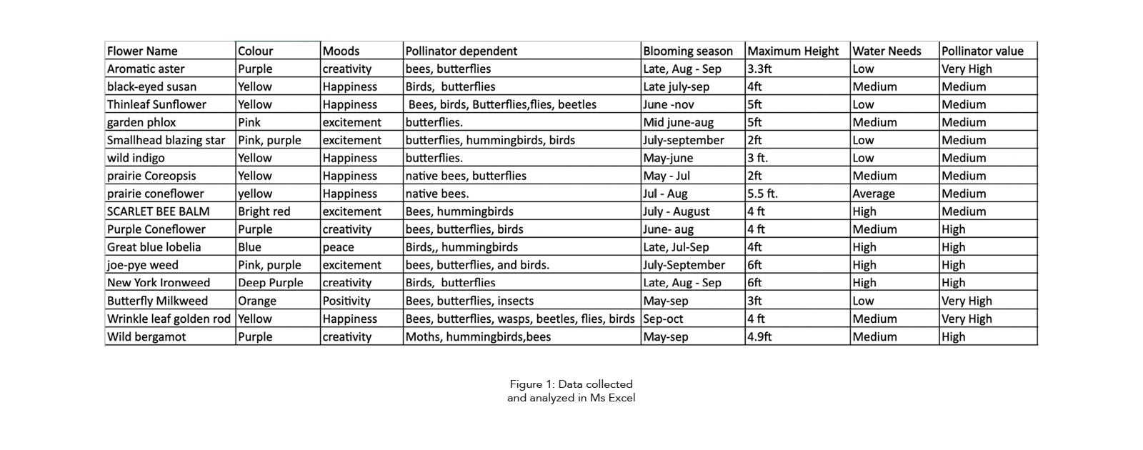
This project was based on the articles and research papers shared by the Penn State Pollinator research centre. The data was then analyzed to identify top pollinator-friendly flowers that can be planted in State College. This further helped to recognize the difference between human vision and pollinator vision. Humans, like other primates, can see the tones of color red, which the bees cannot. Instead, the bees can see the UV colors that help them navigate around the flowers. Therefore, a depiction of how bees see the colors differently in addition to visualizing the generic flower information has been done.
Introduction
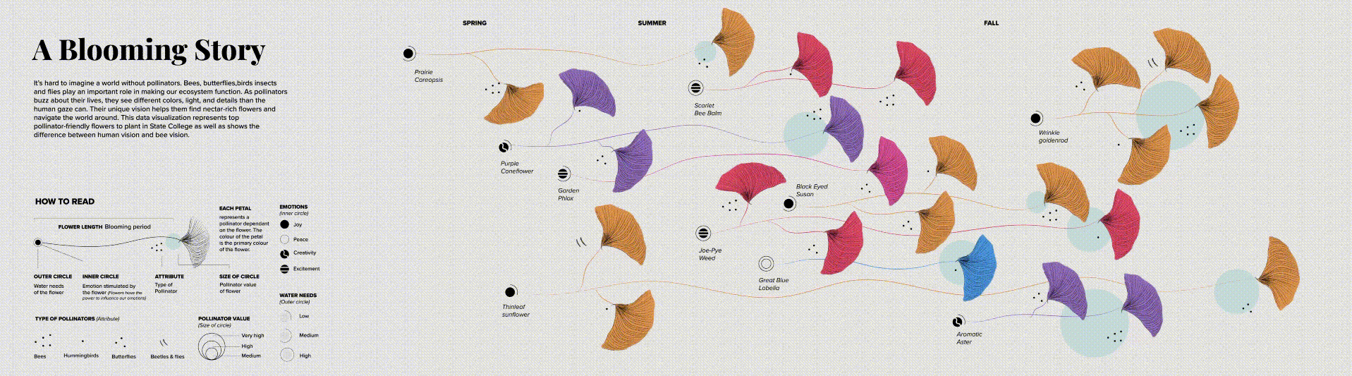
It’s hard to imagine a world without pollinators. Bees, butterflies, birds, flies, beetles and all other insects play an important role in making our ecosystem function. Moreover, as pollinators buzz around the world, they see different colors, light, and details that the human eye cannot. Their unique vision helps them find nectar-rich flowers and navigate around the flower world. Therefore, their sight is a superpower helping them in the pollination process.
This data visualization shows the difference between how humans see the flower colors vs how bees see them at the same time representing top pollinator-friendly flowers in State College. The project aims to explore a way in which data can be represented to influence the user’s behavior.
Methodology
Numerous research papers, articles, and journals provided by the Penn State pollinator research centre were used as the primary source of data for this project. It was then organized, cleaned and categorized into various columns and rows using Ms-Excel. A thorough analysis was done to identify key information which could be communicated to the people. As the key information was layered, the data became easier to process. Several creative explorations were then done to represent the gathered data without making it look too overwhelming. Motion was used as a means to attract the attention of the people and make it visually more interactive. It acts as a switch between human vision and bee vision of the flowers.
Design System
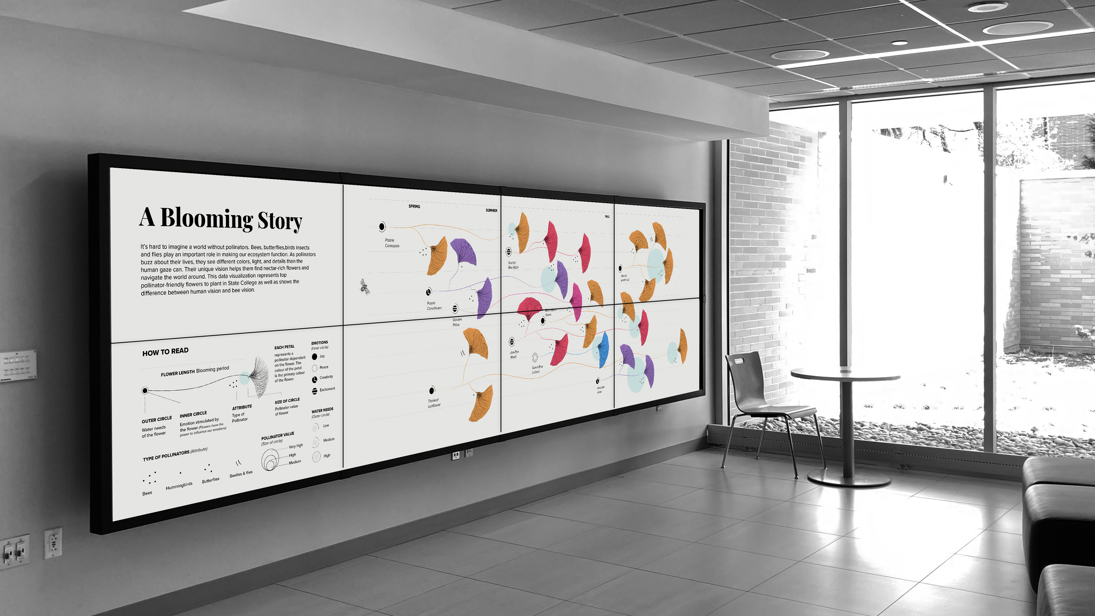
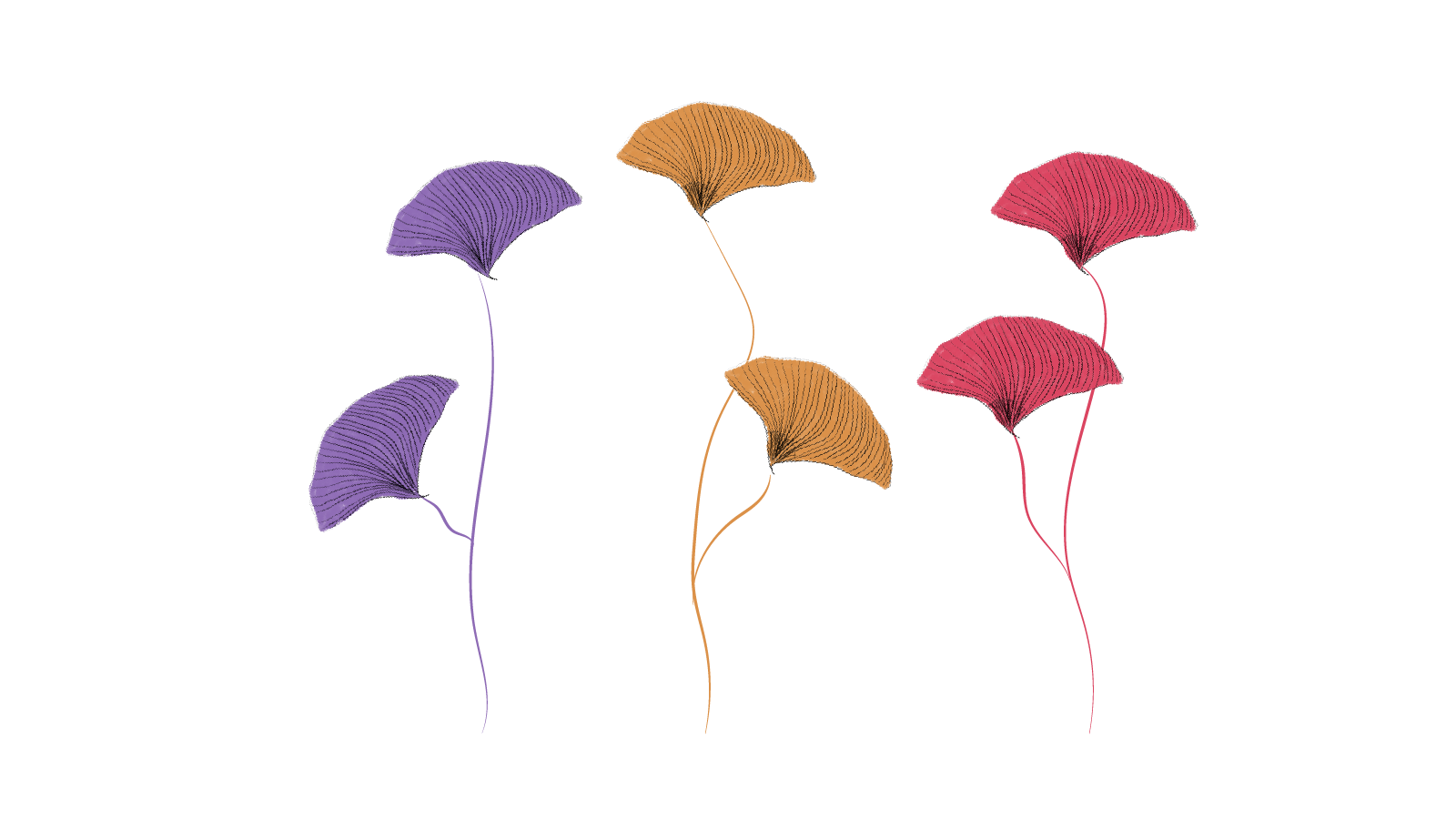
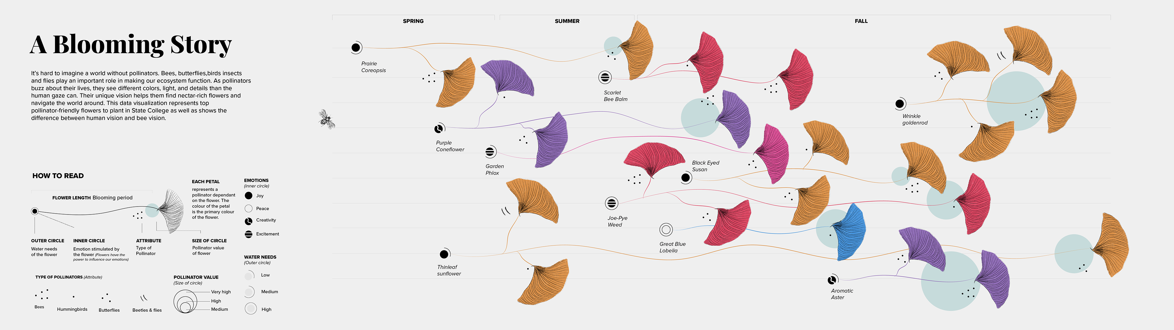
To build a more cohesive visual design language, several experiments were done to develop a visual vocabulary that can portray data based on its meaning. The idea was to use a flower form so that the theme of the visualization can be easily understood even from a distance (Fig.2). Using floral shapes as the primary element helped to develop a visual language which could represent diverse data effectively. Other elements were then created to enhance this narrative. This made the data seem more intuitive and enabled viewers to develop various visual associations. The design uses minimal text and is in the typeface ‘Proxima Nova’. The font works well for the screens and has several weight options.
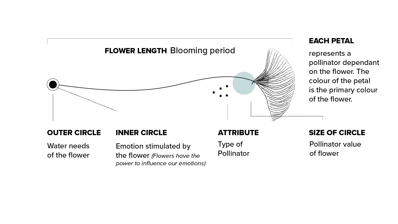
The right portion of each flower stem depicts the information related to the pollinators. The left portion of the flower represents the primary information like the water needs (See fig 3). Another piece of information being communicated is the specific moods/ emotions being triggered among humans by each flower. Flowers have the power to influence human’s emotions due to their color and fragrance. In order to make people feel that planting flowers is not just helpful for the ecosystem but them as well on an emotional level, this dataset was used.
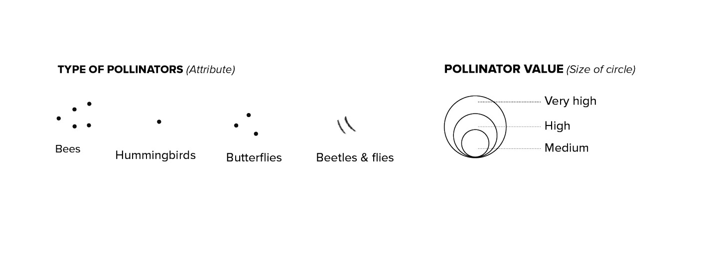
The attribute near each petal represent the type of pollinator getting attracted to it. For the sake of this visualization, it has been categorized into 4 groups- bees, butterflies, birds and other insects like beetles and flies. The size of the blue circle behind each flower represents its pollinator value.
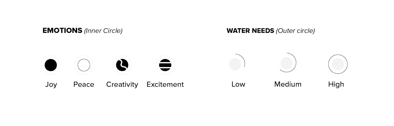
The inner circle represents the type of emotion getting triggered by each flower. For this visualization, four emotions have been used-joy, peace, creativity and excitement.The length of the outer circle represents the water needed by each flower and is divided into low, medium and high.
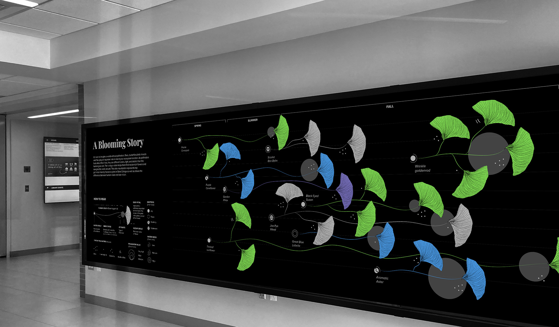
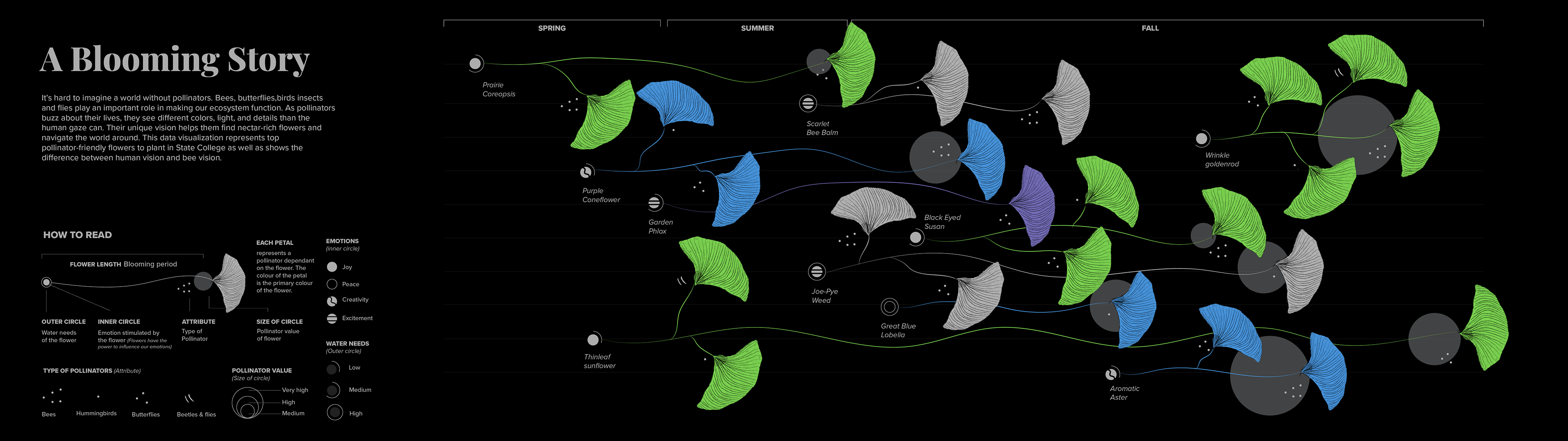
Human vision vs bee vision
Initially the visualization represents how the flowers would look in the eye of a human (fig. above). But gradually as the bee flies towards a flower, the visualization changes. It switches to depict how the same flowers will look in the eye of a bee (fig. below). The switch between human to bee and bee to human versions makes the data seem more interesting.
Usability
One of the primary functions of this project is to make people form connections with the data. Humanizing the data and making it look beautiful will motivate the
on-lookers to spend sometime looking at the information being visualized. Moreover, it will educate people about the pollinator friendly plants in State College. The visualization will help them to make informed decisions. Additionally, it can be served as an educational tool to explain the range of colors visible to a bee eye as compared to a human eye.